Multimedia Gallery

Fan Art, Images, Music


Home Register Login
Album list Last uploads Last comments Most viewed Top rated My Favorites Search
Home > Fan Art Gallery > Ludovic > Ludovic
Click to view full size image
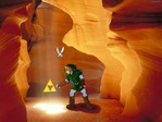
Hyrule's salvation
Phew! It was hard, but it's finish. Corageously made on Paint and pasted on a PC wallpaper. I had a hard time with the shadows and deciding which item would Link be finding in the cave. It will certainly never happen, but it's fun to imagine such a glorious moment. Any critics are welcome.
Scan-zora link.jpg Scan-zora link.jpg Vaati draft.jpg Vaati draft.jpg Link finds the Triforce.JPG Link finds the Triforce.JPG Vaati draft.jpg Vaati draft.jpg Link finds the Triforce.JPG Link finds the Triforce.JPG
File information
Filename:Link finds the Triforce.JPG
Album name:Ludovic / Ludovic
Rating (12 votes):
File Size:107 KB
Date added:Feb 17, 2005
Dimensions:1024 x 768 pixels
Displayed:1026 times
URL:http://www.zeldalegends.net/gallery/displayimage.php?pos=-7393
Favorites:Add to Favorites
Chibi-Kokiri  [Feb 17, 2005 at 01:42 AM]
Paint?! *bites ludovic in anger* I envey your paint skills >.< This is great! The background is very fitting. *bandages Ludovic's bite mark in appology*
Snow White  [Feb 17, 2005 at 02:48 AM]
Oh this is great!! really!! I love it!!
dudeofrandomness  [Feb 17, 2005 at 03:47 PM]
Wow. What can I say? Wow. Ah, here we go, a critique: Link's appearance is slightly...cartoonish? It doesn't match the realistic heavy-detail of the wallpaper. If you could do something to the wallpaper to make it less...different, it'd be even better. Still, great job. Paint. Wow.
2of7  [Feb 17, 2005 at 04:19 PM]
Wow...awesome. I love the backround, it looks great!
Iron~knuckle  [Feb 17, 2005 at 09:23 PM]
incredible. comment; unsure if it's one or the other, but the arms (or legs) seem to short. still gets a 4.5 from me
Koroks Rock  [Feb 18, 2005 at 01:35 AM]
actually, i could completely see this being a visual update of the Zelda 1 Dungeon 4. That's the orange level, which could easily translate into a wind chasm type environment. i likey, very well done, and my comments have already been covered
dudeofrandomness  [Feb 18, 2005 at 04:11 PM]
! some jerk voted a two again ! *votes a 5 to offset it* I'd give it 4.2ish normally...*looks at it again *...Ok, 4.4
Kia  [Feb 19, 2005 at 04:23 AM]
dude, this is so good! i only have paint and i cant even do it that well! its so cool!
CharacterintheBack  [Feb 20, 2005 at 07:36 AM]
That so cool!!
faerie  [May 16, 2005 at 05:42 PM]
really cool two thumbs up
Fire Demon  [May 23, 2005 at 08:00 PM]
really cool whole body up
Dust_Bunny  [May 27, 2005 at 07:37 PM]
O.O PAINT?! another impresie work of yours, absolutley nice job =)
vaati_girl  [May 28, 2005 at 02:16 AM]
OMG.
the_ocarina_of_time  [Jun 07, 2005 at 03:21 AM]
wow, this is good, especially considering you did it on paint. i HATE that program. but i still use it all the time because i'm lazy. it came out well. navi's wings seem a little long, besides that i don't see anything wrong. oh, and link's shadow is sorta weird.
Hyrulegirl  [Jun 26, 2005 at 11:32 PM]
I cry at the fact someone is l33t in paint skills. and I thought I was good. I suck.
IDateZelda  [Aug 04, 2005 at 07:25 PM]
Nice Shading. I wish I was that cool. Six thumbs up!
Ludovic  [Aug 19, 2005 at 01:35 AM]
Thanks everybody! it's been a long time since I made that so expect new works soon! Also thanks for the critics.
Rito_Sage  [Sep 01, 2005 at 05:24 AM]
unbelivable paint work. (excuse my pathetic spelling) *bows to you*
Foamy  [Nov 25, 2005 at 06:41 AM]
Your work was really worth it.