Multimedia Gallery

Fan Art, Images, Music


Home Register Login
Album list Last uploads Last comments Most viewed Top rated My Favorites Search
Home > Fan Art Gallery > dudeofrandomness > dudeofrandomness
Click to view full size image
Attempt #1
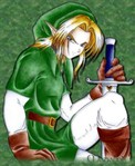
Finally, I reveal a work in progress. I haven't had tons of extra time, so its taken forever...but here it is. By all means NOT the final product, but I wanted to see what you all think. If you didn't know, it's Magalink's picture of Link that I've messed around with. The best is yet to come!
FiveLinks.PNG FiveLinks.PNG link_s parents.jpg link_s parents.jpg TrunksLink.jpg TrunksLink.jpg Oracle_of_Ages-Nayru.png Oracle_of_Ages-Nayru.png linksexpression.jpg linksexpression.jpg
File information
Filename:TrunksLink.jpg
Album name:dudeofrandomness / dudeofrandomness
Rating (11 votes):
Keywords:link
File Size:46 KB
Date added:Mar 03, 2005
Dimensions:549 x 671 pixels
Displayed:767 times
URL:http://www.zeldalegends.net/gallery/displayimage.php?pos=-7475
Favorites:Add to Favorites
Magalink  [Mar 03, 2005 at 08:06 PM]
WOW!!! It looks great!! I love how it turned out, great job!!
Iron~knuckle  [Mar 03, 2005 at 09:11 PM]
the greens blend too much, try a different shade or possibly a different color. still looks great
Chibi-Kokiri  [Mar 03, 2005 at 10:44 PM]
Ohhh! So nice I love pics with backgrounds. You dont see them enough...
Nemorensis  [Mar 03, 2005 at 10:58 PM]
Wow, excellent tinkering. Try a different shade of green for the background, though; it's hard to make out Link from the rest of the pic.
Koroks Rock  [Mar 04, 2005 at 04:15 AM]
good work. i'm too tired to comment further, sorry, i'll say more later.
dudeofrandomness  [Mar 04, 2005 at 05:00 AM]
*holy instant comments!* Yeah, I was actually tring to match the green, but I see what you're saying. That's nice that you like it, but I was looking for really critical comments (especially from you KR!) so that the actually finished product could be perfect. What do you think about the belt? Was the drop shadow-ish effect good? DId I smooth the colored-pencil marks nicely? Notice the bottom part, how it fades out as opposed to the thick black outline around the rest of him: that was so annoying. I couldn't get the white out of there so I faded it out. I tried to maintain ML's sig, but it faded a little as well. I'm tempted not to try and do any more, but I want it to be absolutely perfect. What would make it better?
Nemorensis  [Mar 05, 2005 at 12:52 AM]
Perhaps a dark back drop with lighter orbs of light floating around (like in the Kokiri Forest), and a bit more shading on the leggings and arms, etc.
Ganondorf  [Mar 05, 2005 at 03:04 AM]
Wow! That's awesome, dudeofrandomness. I swear I need Photoshop
dude_thats_evil  [Mar 05, 2005 at 09:24 PM]
In my professional opionion i would have to suggest the matter of inconclusitivity, you see... well you need more of the perogative of the negative solution without the sudden mural of integrity. That and the black outline around him makes it look kinda dumb, and inside his shirt is kinda ruffled and bad, and well lets face it random dude i cant tell the difference between the bg, and Link. You wanted to know what you needed to fix and there it is, now get going on your masterpiece
bathroomhacker  [Mar 05, 2005 at 10:50 PM]
wow nice coloring. and uh.. its nice. it is also good. ....
CharacterintheBack  [Mar 05, 2005 at 11:07 PM]
WOOOOOOOOWW~ That's cool!!
dudeofrandomness  [Mar 06, 2005 at 03:32 AM]
Oohhh, wait till you see...Check out the new one I'm about to upload. I have fixed the background so its mixed green and blue, but its not a significant change from this one, so Im not posting that one. But the other one... genius (or luck)
Koroks Rock  [Mar 06, 2005 at 08:00 PM]
DTE, i can outword you any day of the week, and mine'll use real words. though the bulk of you comment was accurate and insightful, the opening sentence boiled down to nothing.
Nemorensis  [Mar 06, 2005 at 10:08 PM]
No one doubts you, KR. It wuold be nice to see the other pic, no matter how slight the change would be, DoR.
dude_thats_evil  [Mar 07, 2005 at 07:39 AM]
*challenges KR* lets see what you've got, i doubt you could even match the powers of my absolute inteligence squared. Obviously the matter of the fact is innacurate, and unjust yet it mostly protrays the theorum of realativity to the final result and is indefinetly WRONG!!!
dudeofrandomness  [Mar 07, 2005 at 04:00 PM]
and for KR for being so, himself. If Nem. really wants to see it...I guess I could post the other one. Pretty much all I changed was the background. I enhanced the color a *tiny* bit as well, but it's probably not even noticeable. I'll post it sometime...but not for a couple days probably (cuz im laZ)
Koroks Rock  [Mar 08, 2005 at 11:50 PM]
ph34r me DTE. ph34r my intense and manifold plethora of alphanumeric arrangements which are generally constituted as words but a small percentage of the educated population occasionally is not entirely certain thereof. however, considering the miniscule size and relative intelligence (j/k) of this community of laudeers, i have little to preoccupy myself with, in regards of the verity of my vocabulary and grammatic usage.
dude_thats_evil  [Mar 09, 2005 at 07:18 AM]
In my theory, i would have to suggest the use of Methylchloroisothaizolinone is in-humain because of the existince of partical beings which coincide with the whole theorum of Joliot-Curies'. Obvilously they create a negative effect with all of the positron-emitting isotopes involved in the situation and must be superimposed until both the Y-value and X-value can be equal in length. In conclusion Methylchloroisothaizolinone is accuminically too exhausting in the retrospective perspective and must therefore be taken off the market.
Koroks Rock  [Mar 09, 2005 at 02:22 PM]
are you speaking of atomics or a drug? your word choice strongly indicates both, but is not definative in either direction. now i'm off to get more c0ff33.
dudeofrandomness  [Mar 09, 2005 at 03:54 PM]
light green? whatevs. Personally I find that the sum of the square of the standard deviations of two combined distributions equals the square of the new standard deviation for the resulting distribution. (we should totally take this conversation into a forum)
dude_thats_evil  [Mar 09, 2005 at 11:01 PM]
sorry i didn't clairify in big bold letters that i was talking about the drug Methyllchloroisothaizolinone
Nemorensis  [Mar 10, 2005 at 04:51 AM]
Wow, a lot of confusing words. Oddly, almost understandable. And KR, I would like to defend mine and my colleagues' miniscule in size and relative intelligence (or lack thereof), by saying we're not as dumb as you may consider us to be; we know how to read the captions on LoZ.
dude_thats_evil  [Mar 10, 2005 at 03:02 PM]
I was just about to suggest the same thing, except for i would have done it in 3D *goes on a quest for food (at random dude's house)*
dudeofrandomness  [Mar 10, 2005 at 04:45 PM]
*just barely realizes that c0ff33 isn't a hexadecimal color notation, its a caffienated **spelling! ** beverage* *skrags dte b4 he gets to my house*
dude_thats_evil  [Mar 10, 2005 at 11:53 PM]
*air-dodge* yea the food is mine!!!
dudeofrandomness  [Mar 11, 2005 at 03:51 PM]
*air dodges don't last long enough to escape a skrag*
dude_thats_evil  [Mar 15, 2005 at 05:56 AM]
I am Kirby, so i will get near the edge and not just use cheapness, but extreme cheapness and let you die by way of mouth
Armed_stalfos  [May 26, 2005 at 11:40 PM]
ummm okaaay.....let's get back to the pic OK? very nice pic random dude!
dude_thats_evil  [May 27, 2005 at 12:09 AM]
We really should take the "Geniusocity Talking" to a forum, WHERE I WOULD RULE... the forum... BUT I WOULD DEFINETLY RULE... the forum...
RICKY  [May 27, 2005 at 05:36 PM]
Okay dudeofrandomness I'm confused...who's artwork is that? Did you and MagaLink work together? Cool...artists helping artists.
Hyrulegirl  [Jun 10, 2005 at 11:57 PM]
.....cool...............................................
star_breaker  [Dec 07, 2006 at 06:45 PM]
Personally I feel there is nothing in particular wrong with this artwork. the overall effect of the graphics coincides with the original artwork. OH YESH! hahahaha