Multimedia Gallery

Fan Art, Images, Music


Home Register Login
Album list Last uploads Last comments Most viewed Top rated My Favorites Search
Home > Fan Art Gallery > Koroks Rock > Korok's Creations
Click to view full size image
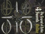
4 Swords Online BG
So, during my lunch i doodled a bit, very bored-like, and came up with a few little 4s in capital Os. I've been thinking for sometime about reincarnating the Zelda Online idea as a Cube Legends gamemode, and the sketches seemed to jump out at me "4 Swords Online!!"

So i took the sketches, went over to a comp with a scanner, and dropped the images into photoshop. twenty minutes later, with a little help from a CD of Zelda Media (something i recommend all fanartists make), I had a half-decent background.

So ja, just a little something to ease my appalling lack of fanart. Simple, easy on me, and maybe a bt of fun for yall to think about. Who knows, maybe it'll be worth it for me to code a zelda gamemode into CL (which started out as a zelda game, btw)
4sOnline.jpg 4sOnline.jpg achitka.png achitka.png anniversary_grey.png anniversary_grey.png bday_color.png bday_color.png BHchallenge.gif BHchallenge.gif
File information
Filename:4sOnline.jpg
Album name:Koroks Rock / Korok's Creations
Rating (8 votes):
File Size:188 KB
Date added:Sep 28, 2005
Dimensions:800 x 600 pixels
Displayed:592 times
URL:http://www.zeldalegends.net/gallery/displayimage.php?pos=-9407
Favorites:Add to Favorites
Koroks Rock  [Sep 28, 2005 at 01:12 AM]
i realize that there are a lot of glitches around the doodles- maybe when i have more time than my lunch period i'll clean them up.
Amy122  [Sep 28, 2005 at 01:27 AM]
that's good just redo the 4's and your good to go lol 5!
Koroks Rock  [Sep 28, 2005 at 02:52 AM]
as in strighten them up or clean up the white? they could use both... please critique my work guys!
aquawolf  [Sep 28, 2005 at 04:59 PM]
nice idea with teh 4 swords in pointing in different directions. one suggestion: maybe fade the words there on teh right- they just seem to jump out too much. I like it, though.
dude_thats_evil  [Oct 23, 2005 at 09:41 PM]
hey KR, i think this is your best yet... u always say that your stuff is just rough drafts, and i believe u too, because i really havent seen many impressive things out of u, but this changes that... this is really well done!
Koroks Rock  [Oct 24, 2005 at 04:24 AM]
yeah... commisioned work always takes precedence over ZL projects. to be perfectly honest, i don't spend hardly any time working on selda stuff anymore, because i am a poor graphics student who needs to make the best work he can, so he can continue to do so. once cross country season ends (before i get a real job *groan*) i'll see if i can't completely go thru my gallery and finish everything, ok?
dude_thats_evil  [Oct 24, 2005 at 07:04 AM]
lol i know what u mean... minus the getting a real job... (my job rules i make ULTRA $$$) but ya... i rarely sit down and draw zelda stuff... in fact i haven't drawn anything zelda in a long time... all i do anymore is play the keyboard, work, skateboard, and school
firehexer  [Feb 20, 2006 at 01:42 AM]
It's not such bad, KR!
Lady of Flame  [Jun 13, 2006 at 02:42 AM]
i have to agree with aquawolf, that white text is really bright, but it looks cool